ADMINISTRATIVE
- Joined
- Nov 1, 2020
- Messages
- 1,413
- Reaction score
- 770
- Points
- 113
- iCoin
- 14,071 K
- Thread starter
- Administrator
- Moderator
- #1
- Compatible with XF versions
- 2.2; 2.3
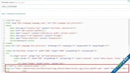
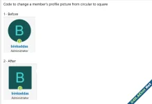
Go to widgets admin.php?widgets select add HTML widget and write the code:
CSS:
You must log in to view
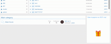
(387 lines)ta được món quà như này
Last edited:
![[XB] XFRM: Purchasable Resources](/data/resource_icons/0/589.jpg?1760024912)
![[BR] Credits](/data/resource_icons/0/396.jpg?1749898335)
![[tl] Anonymous Posting](/data/resource_icons/0/380.jpg?1749147103)